Mobile Commerce: Why Your Checkout Might Be Losing Half Your Sales
Mobile traffic often makes up half your visitors, but converts at less than half the rate of desktop. Here's what the research says is actually happening.
Pull up your Shopify analytics and look at two numbers side by side: mobile traffic share, and mobile conversion rate. For most stores, the first number is large and the second is disappointing, and the gap between them is bigger than most merchants realise.
The gap is real, and well documented
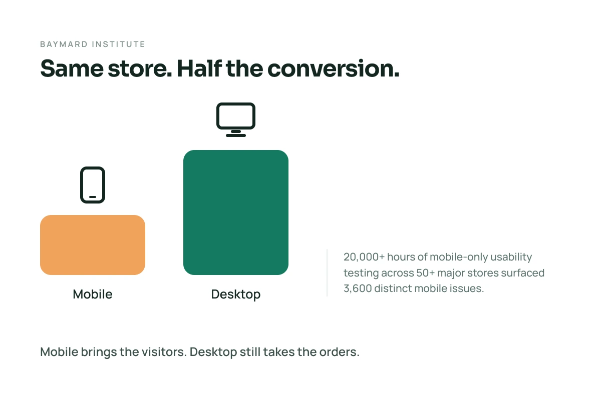
The Baymard Institute, an independent ecommerce UX research firm, has spent more time studying this specific gap than almost anyone. Their research found that mobile traffic now often makes up 50% or more of total ecommerce traffic on many sites, yet it's not unusual for that same store's mobile conversion rate to run at less than half its desktop rate. That finding comes from one of the most substantial studies on the topic available: over 20,000 hours of mobile-only usability testing across more than 50 major ecommerce sites, which surfaced more than 3,600 distinct mobile-related usability issues.
That's not a rounding error. It's a structural pattern showing up across a huge range of real stores.
A consistent, if not perfectly uniform, pattern also shows up in cart abandonment specifically. Multiple sources tracking device-level abandonment converge on mobile running meaningfully higher than desktop, generally somewhere in the range of 10 to 15 percentage points worse. The exact figures differ slightly depending on the study and measurement window, but the direction is consistent everywhere it's been measured: mobile shoppers add things to a cart and then don't finish, more often than desktop shoppers do.
Why mobile specifically struggles
The instinct is to blame slow load times or a cramped screen, and those matter, but the more useful framing comes from a genuinely influential piece of UX thinking: Luke Wroblewski's "Mobile First" approach, first published in 2011 and still holding up. His argument is that designing for the most constrained context, small screen, thumb-only input, one hand, distracted attention, tends to produce a better result across every context, not just mobile. Most ecommerce teams do the opposite. They design for a 27-inch monitor and a precise mouse, then compress that design down to fit a phone.
That compression is where things break. A desktop checkout form fits comfortably on one screen. The same form on mobile often splits across several screens, and every additional screen is a fresh chance for someone to give up. Typing itself is harder on a touchscreen than a keyboard, which makes every optional field, every account-creation prompt, every unnecessary bit of typing cost more on mobile than it does anywhere else.
What actually helps
A few things follow directly from the research rather than guesswork:
- Design the checkout for a thumb first, then check it works with a mouse. Not the other way around. Buttons and fields sized for a fingertip on a small screen, not a mouse cursor on a large one.
- Cut form fields ruthlessly on mobile specifically. Every field you can remove or auto-fill removes a chance to lose someone mid-type.
- Offer digital wallets prominently. Apple Pay, Google Pay, and Shop Pay remove the most painful part of mobile checkout entirely, typing out card details on a small keyboard.
- Reduce how much a shopper has to type or scroll to actually choose a product, not just to pay for it. A lot of mobile friction happens before checkout even starts, scrolling through long product grids, comparing specs across multiple tabs a phone doesn't really support well. Anything that replaces typing and comparing with a few taps tends to help disproportionately on mobile, since tapping a preset answer is far easier on a touchscreen than filtering, searching, or reading through a long comparison table. A short guided quiz is one example of this, since the entire interaction is built around tapping rather than typing, which is exactly the constraint mobile checkout research keeps surfacing as the real problem. It's the piece of this we focus on at Suggesto, though the underlying principle, replace typing and scrolling with tapping wherever you can, applies well beyond any one tool.
Key takeaways
Mobile traffic dominates most stores' numbers, and mobile conversion still lags meaningfully behind desktop almost everywhere it's been measured. The research points to a consistent root cause: mobile shopping experiences are usually a compressed version of a desktop design rather than something built for a thumb and a small screen from the start. Fixing that, checkout length, digital wallets, and cutting down how much typing and comparing a mobile shopper has to do, tends to matter more than any single trick.
Frequently Asked Questions
Why does mobile convert worse than desktop in ecommerce?
According to Baymard Institute research, mobile ecommerce experiences are frequently designed for desktop first and compressed down for mobile, which introduces friction, longer checkout flows, harder typing, more scrolling, that costs more on a small touchscreen than on a desktop with a keyboard and mouse.
How much worse is mobile cart abandonment than desktop?
Multiple sources tracking device-level cart abandonment consistently find mobile running higher than desktop, generally in the range of 10 to 15 percentage points, though the exact figures vary slightly by study and measurement period.
What's the fastest fix for mobile checkout?
Adding prominent digital wallet options like Apple Pay, Google Pay, or Shop Pay tends to have an outsized impact, since it removes the most painful part of mobile checkout, typing card details on a small keyboard, almost entirely.
What does "mobile first" design actually mean?
It's a design principle from Luke Wroblewski's 2011 book of the same name: designing for the most constrained context (small screen, thumb input) first, rather than designing for desktop and then compressing that design down for mobile afterward.
References
- Baymard Institute. Mobile E-Commerce Usability Guidelines.
- Wroblewski, L. (2011). Mobile First. A Book Apart.